Frio
Creating Joyful Rituals Through Fresh, Frozen And Delicious Snacking Alternatives
Project Type
Branding

Challenge
Nice Fruit, which owns a unique patented technology (NiceTech) that brings life to frozen food by respecting its essence, integrity and soul, decided to penetrate the Saudi Arabian market with their healthy snacking options.
They commissioned Blue Hat to come up with a branding strategy, a product name and product packaging designs that marks up their strategic position in this new market and helps them stand out.

Intervention
Our team kickstarted the project with a deep listening session to derive insights from the client about Nice Fruit and their patented technology followed by a thorough research on global trends, Saudi Arabian market insights and behavioral changes happening at that moment.
In the process, we identified a gap in the market, and positioned the brand as the only frozen, fruit based, natural and raw products range that creates joyful rituals for kids and health enthusiasts.
With its defined target audience, we refined the brand’s purpose, values, and onlyness statement as such:
“The only fruit brand that offers fresh, frozen and delicious alternatives to children and health enthusiasts looking to enjoy their snack time and boost their energy in an age of increased health-consciousness.”
To wrap up our strategy, we concluded that the brand is clearly the innocent personality as it is all about being trustworthy, convenient, authentic and fun.
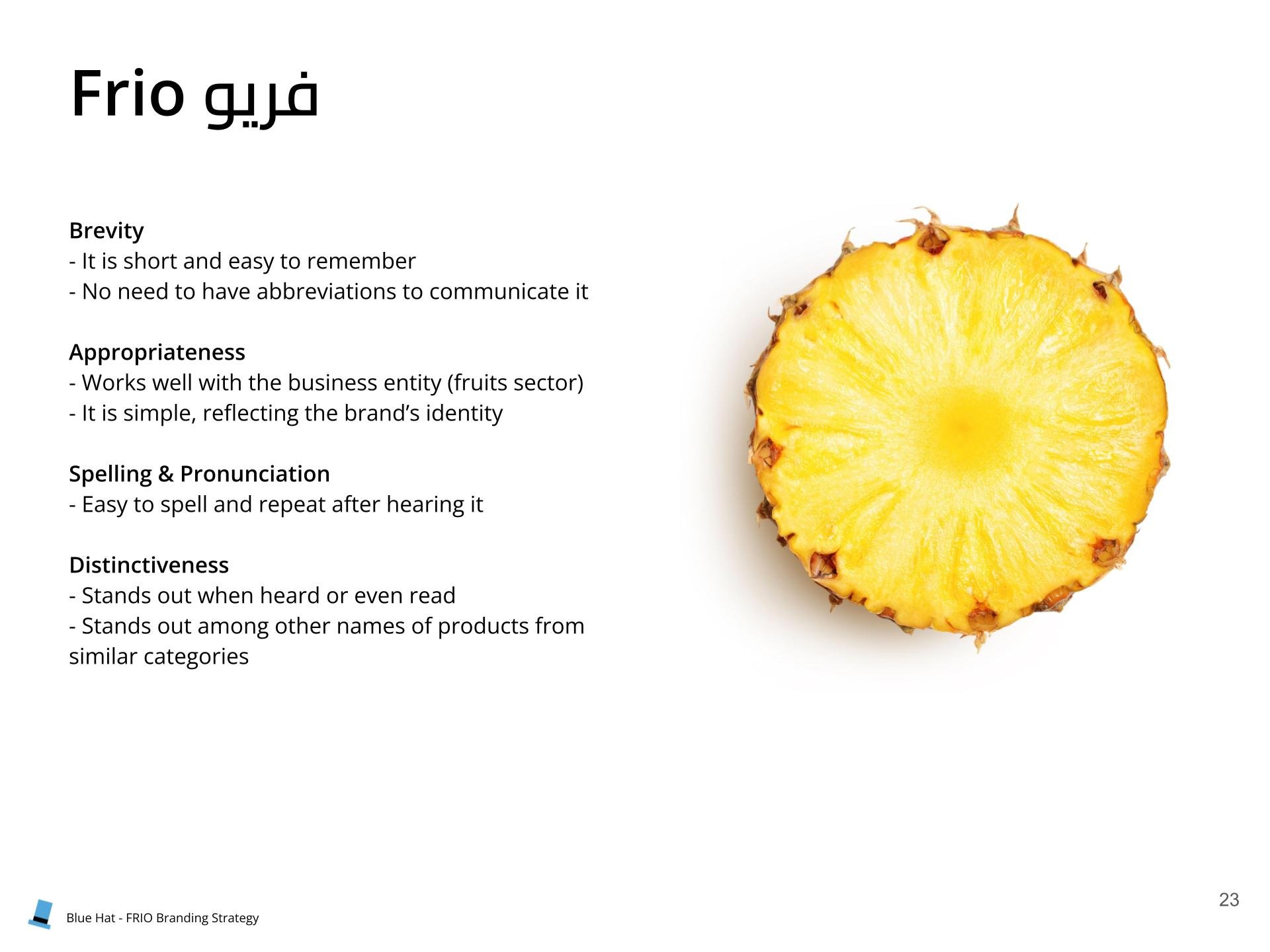
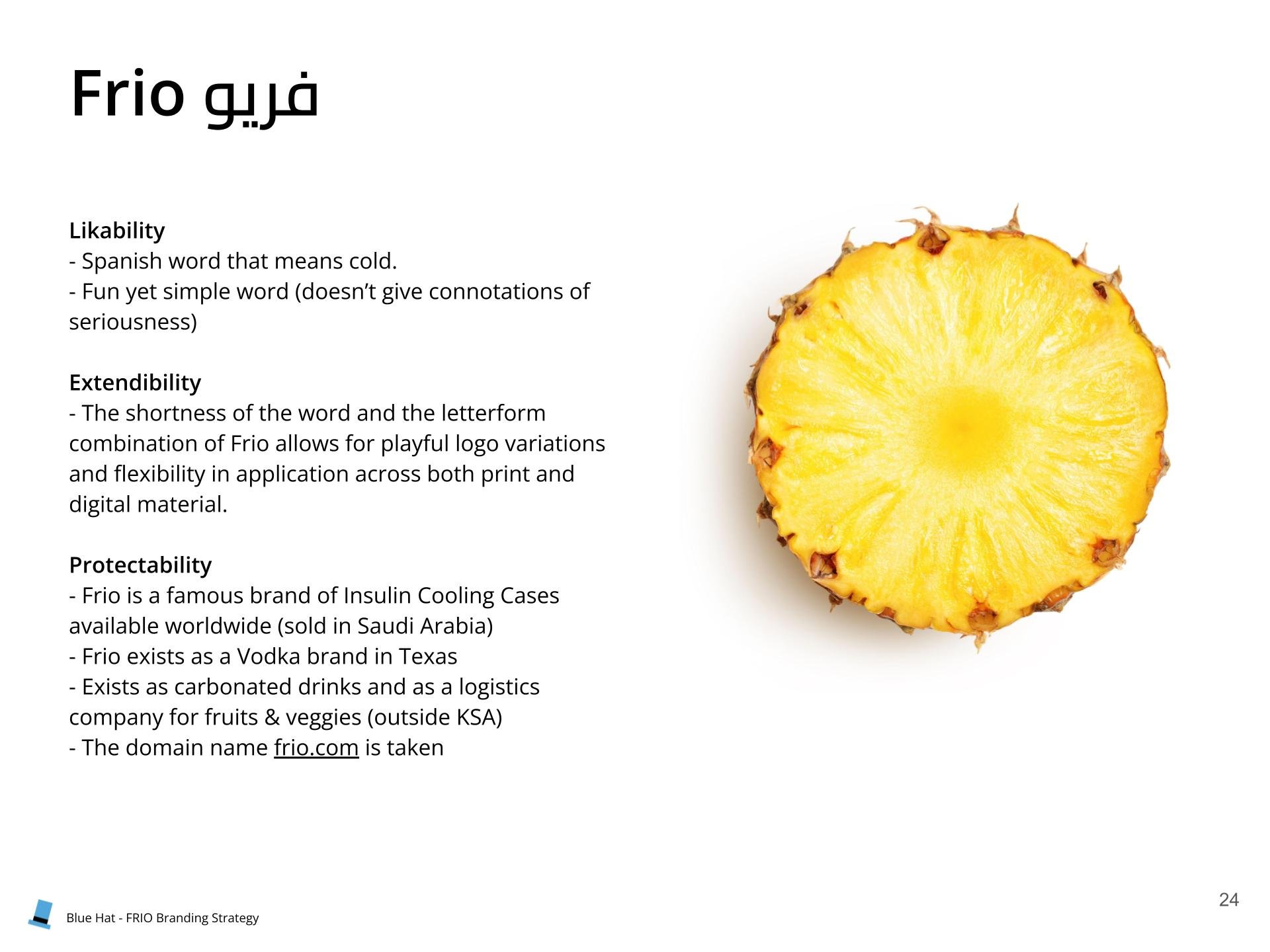
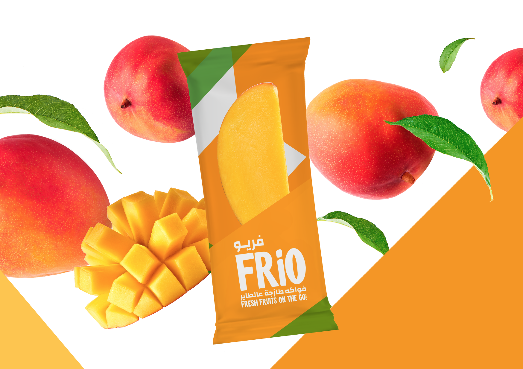
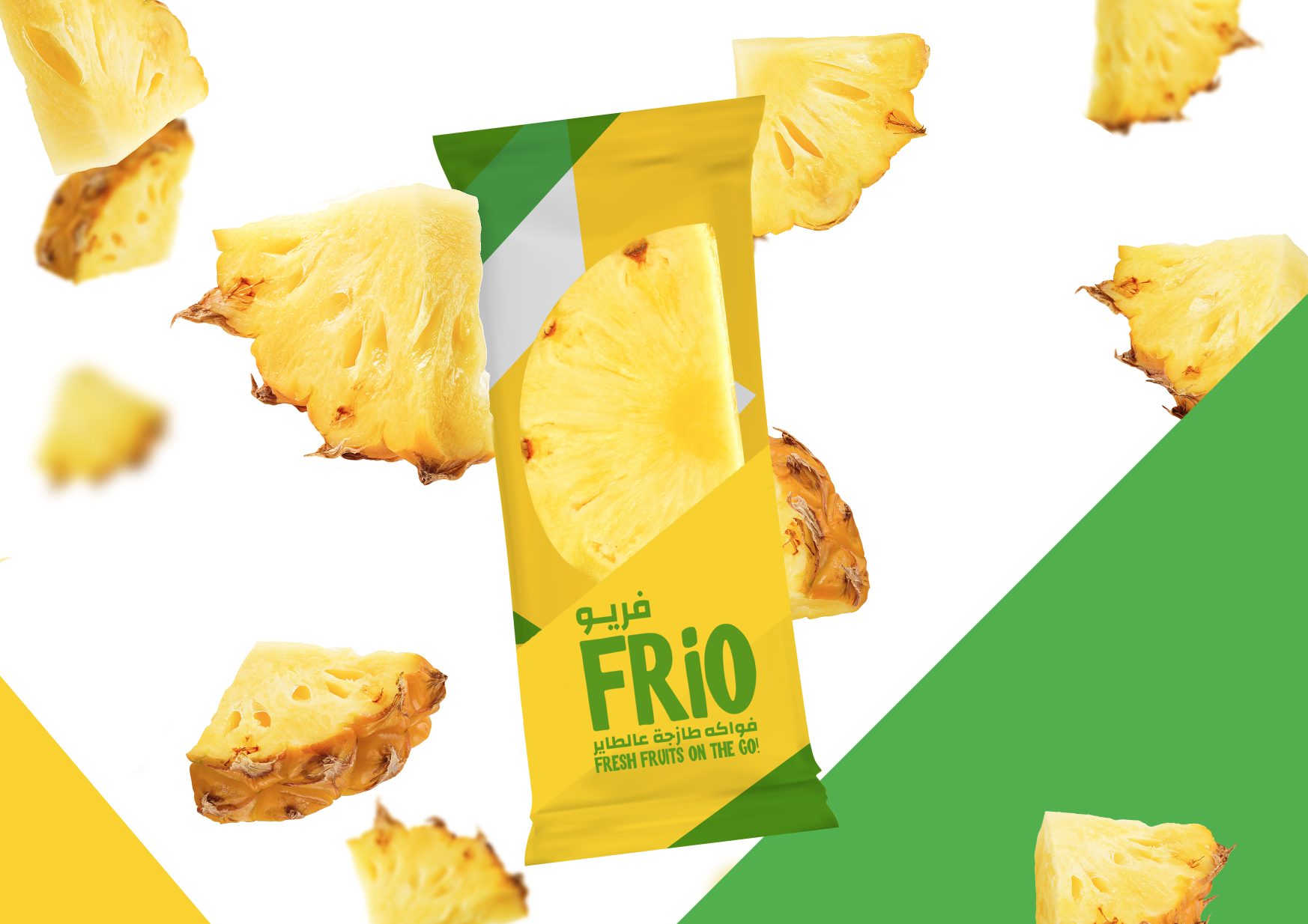
In order to come up with a product name we followed a neological naming style and found the name “ FRIO '' which stands for frozen in Spanish. We ensured that the name scores high on the main naming criteria framework from being short and simple (brevity), appropriate to the business, easy to pronounce, unique as it is playful and would stand out among other product names in the same category and finally extendibility and potential for growth.
Results
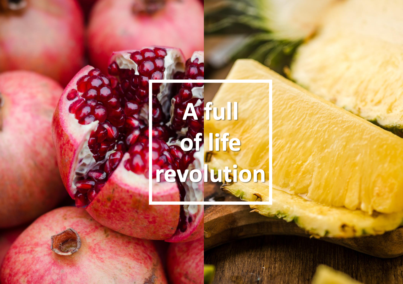
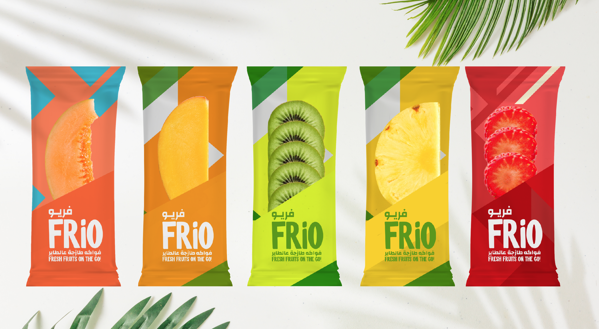
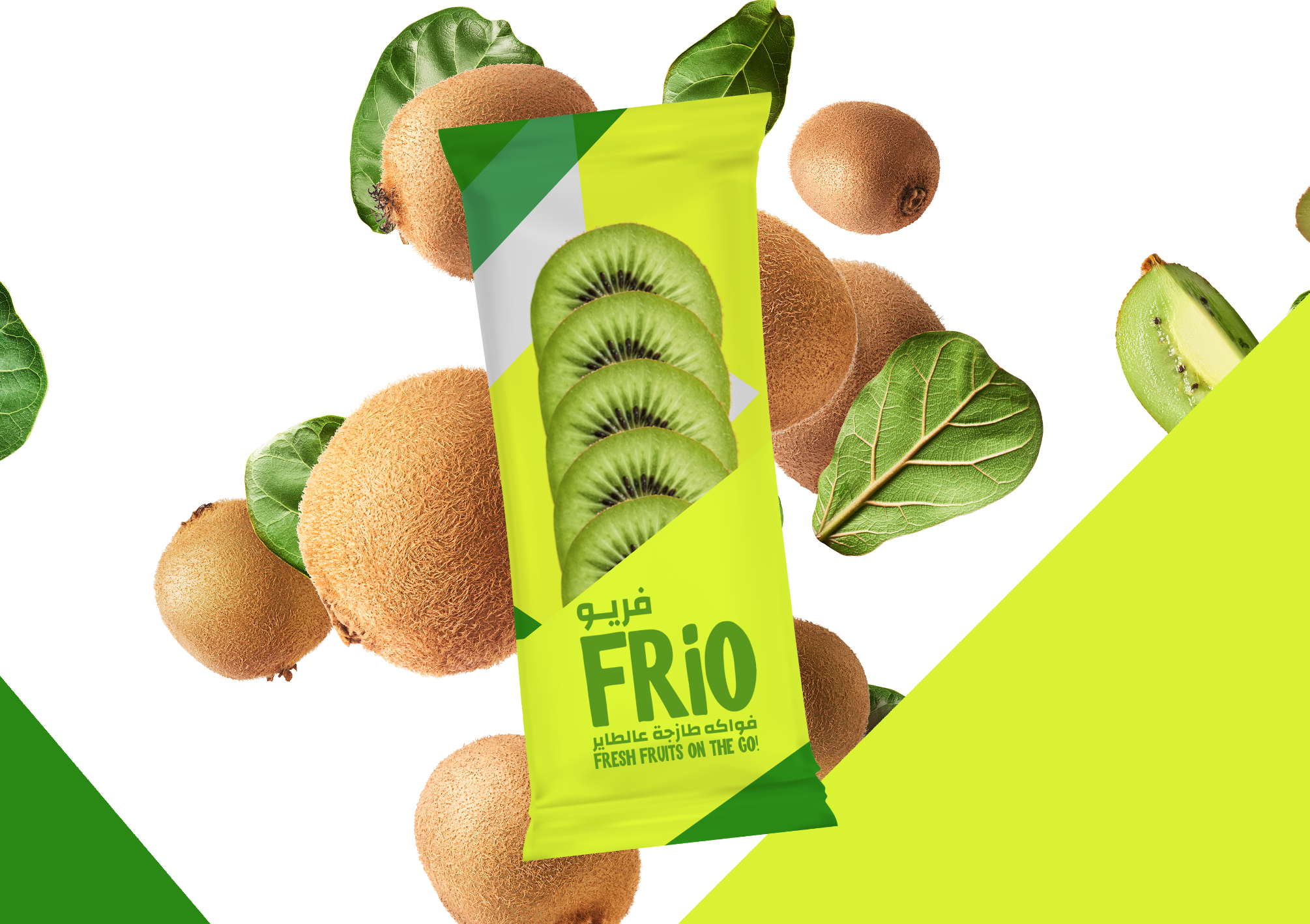
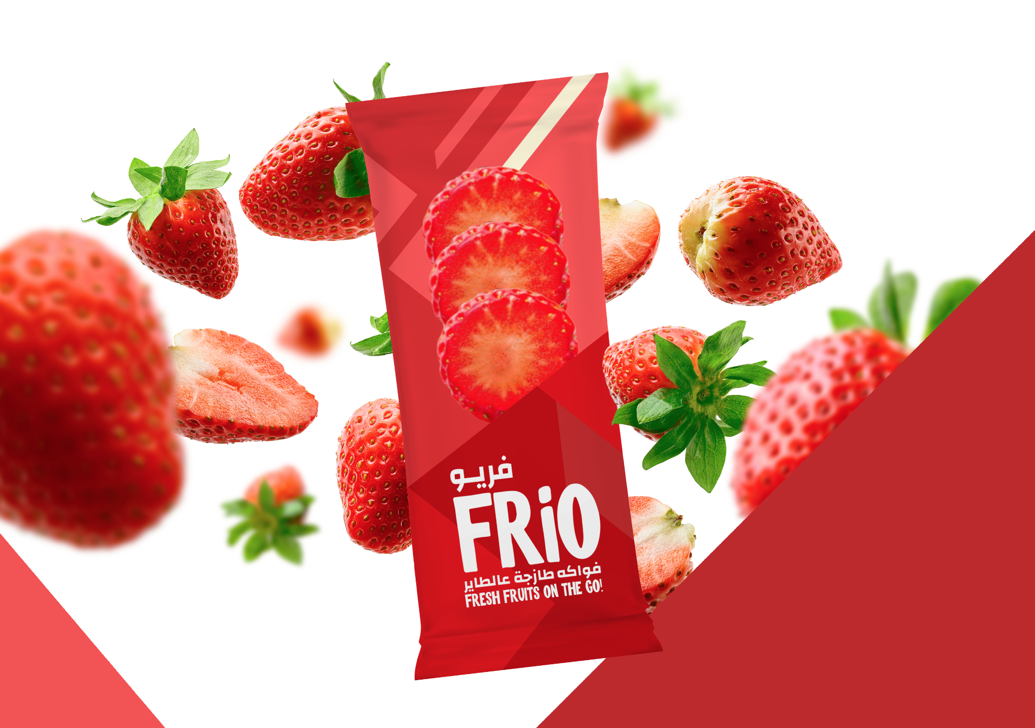
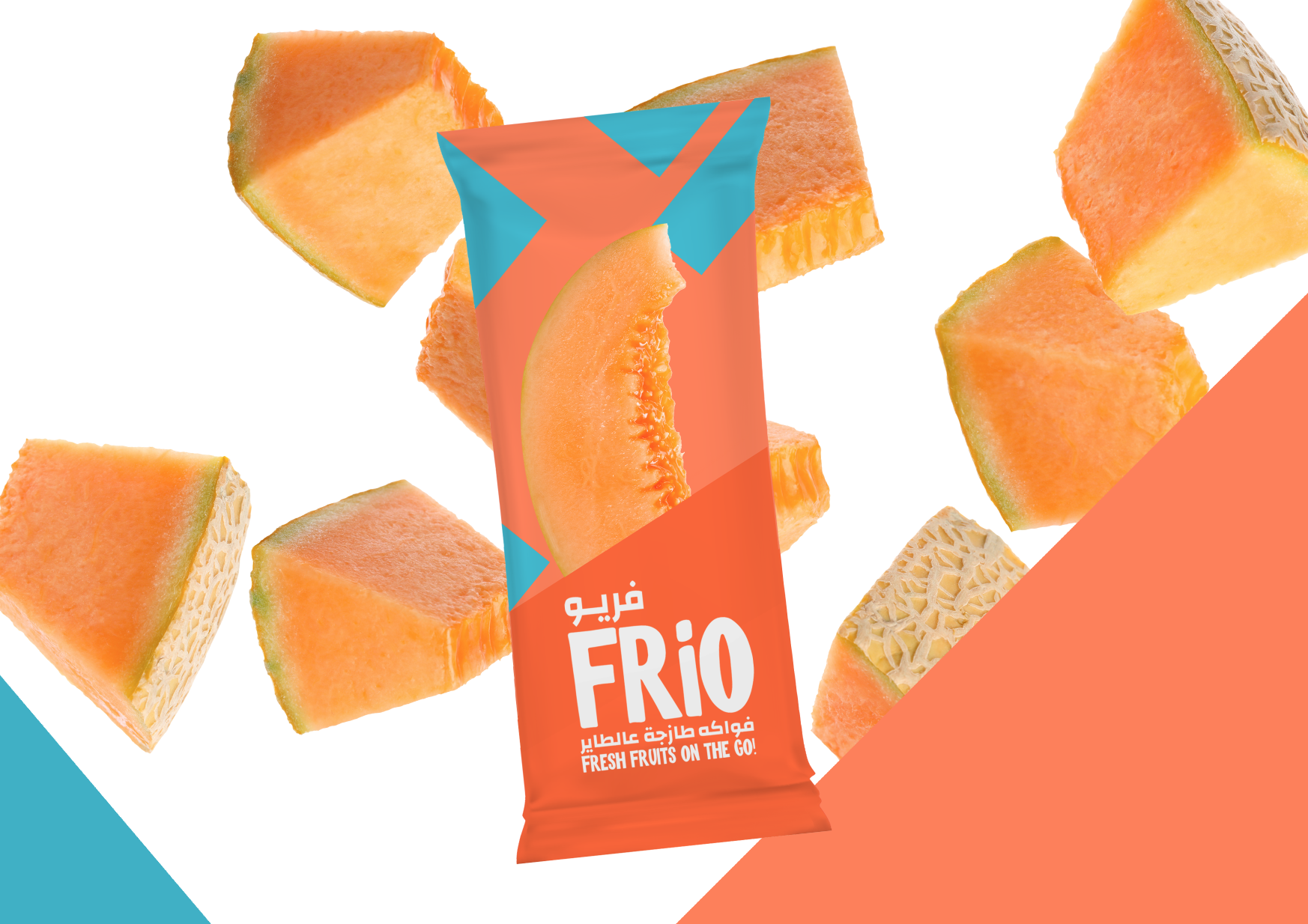
By Frio being an innocent brand, we designed a packaging that captures honesty, transparency and trust. The label is color coded so that it reflects each individual fruit ie. We used green and yellow for the pineapple, red and grey for the strawberries.
The color palette is vibrant and attractive, it is essential to reflect the fun and joy which is at the core of the business, especially that this healthy product is competing against big players in the market which are usually the unhealthy and sweet snacks from chocolates to ice-cream popsicles.
Transparency is a core element of this package, this is why we used a see-through label to allow the fresh fruit inside to show, in a what you see is what you get kind of way, to show the consumer that Frio does not shield anything and that they are getting the best healthy snack in the best shape.
On the back, we included a detailed step by step list of instructions to store and consume Frio for an optimal snacking experience, especially that Frio does not contain any additives and preservatives and has a low shelf life outside of the fridge and should be consumed in its frozen/cold form. In addition to that, we listed the nutritional information and showed the simplicity of the product which contains only the fruit and nothing else.


People Also Viewed


Blue Hat™ - All Rights Reserved.