Qaweem
How to Leverage Technology & Customer Centricity to Empower Patients in a Rehab Center?
Project Type
Innovation
- Service Design
Branding
Digital Marketing
Achievements
Gold Transform Award for “Best Brand Evolution”
Challenge
Qaweem is a private rehab center for addiction treatment in Saudi Audia, offering in-patient and out-patient services. Qaweem’s mission is focused on empowering beneficiaries and breaking the stigma revolving around addiction. Even though their positioning was clear, their reputation, brand awareness, and communication was not conveying that.
They commissioned Blue Hat to establish the center’s reputation and credibility, in an effort to increase admissions. With Saudi locals seeking treatment abroad due to concerns towards local centers, part of the strategy was also working on enhancing the experience in order to convert skeptics into believers of recovery, and eventually Qaweem brand ambassadors.
Intervention
Our rebranding strategy began with research which included closely studying KSA insights, international trends, and case studies, in order to grasp the industry’s standards. Second part of the research included an introspection, in which a spatial audit was conducted, in addition to ethnographic research.
We organized several interviews with specialists and recovered addicts in order to fully understand the user journey at Qaweem. Based on that, we started out with patient experience design that included mapping out customer journeys from the instant beneficiaries enter the center, until the moment they graduate and beyond. Building on that, we identified Qaweem’s target audience and personas which included The Skeptics, The Frustrated Parents, The Potential Beneficiaries, and The Anxious Beneficiaries.
In order to create a brand identity that truly showcased Qaweem’s ethos, we conducted a branding workshop with the client to identify the main pillars of the brand; personality, style, values, color palette, and logo types.

Branding Strategy
One increasingly important focus of rehab centers is to apply innovative design concepts to achieve functional goals, while fulfilling the unique emotional needs of patients. Based on our research and this aim, we defined our main objectives as following:
Building brand awareness
Increasing admissions
Enhancing the beneficiaries’ experience.
In order to build brand awareness, we recommended the following changes:
Remodeling their social media accounts to make it look more inviting (such as designing their instagram grid).
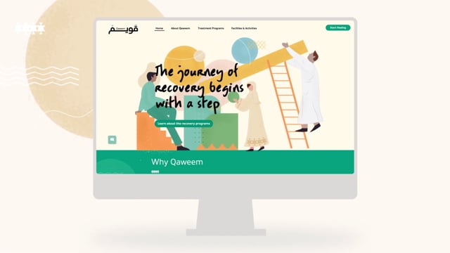
Creating a new website for Qaweem which involved rethinking the sitemap, wireframes, and the whole content to better cater to potential beneficiaries searching for centers in KSA online.
Using SEO techniques to get better traffic on the website.
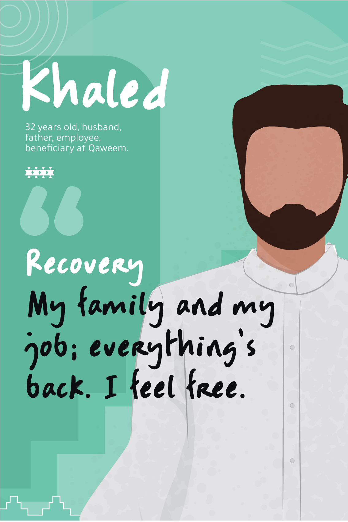
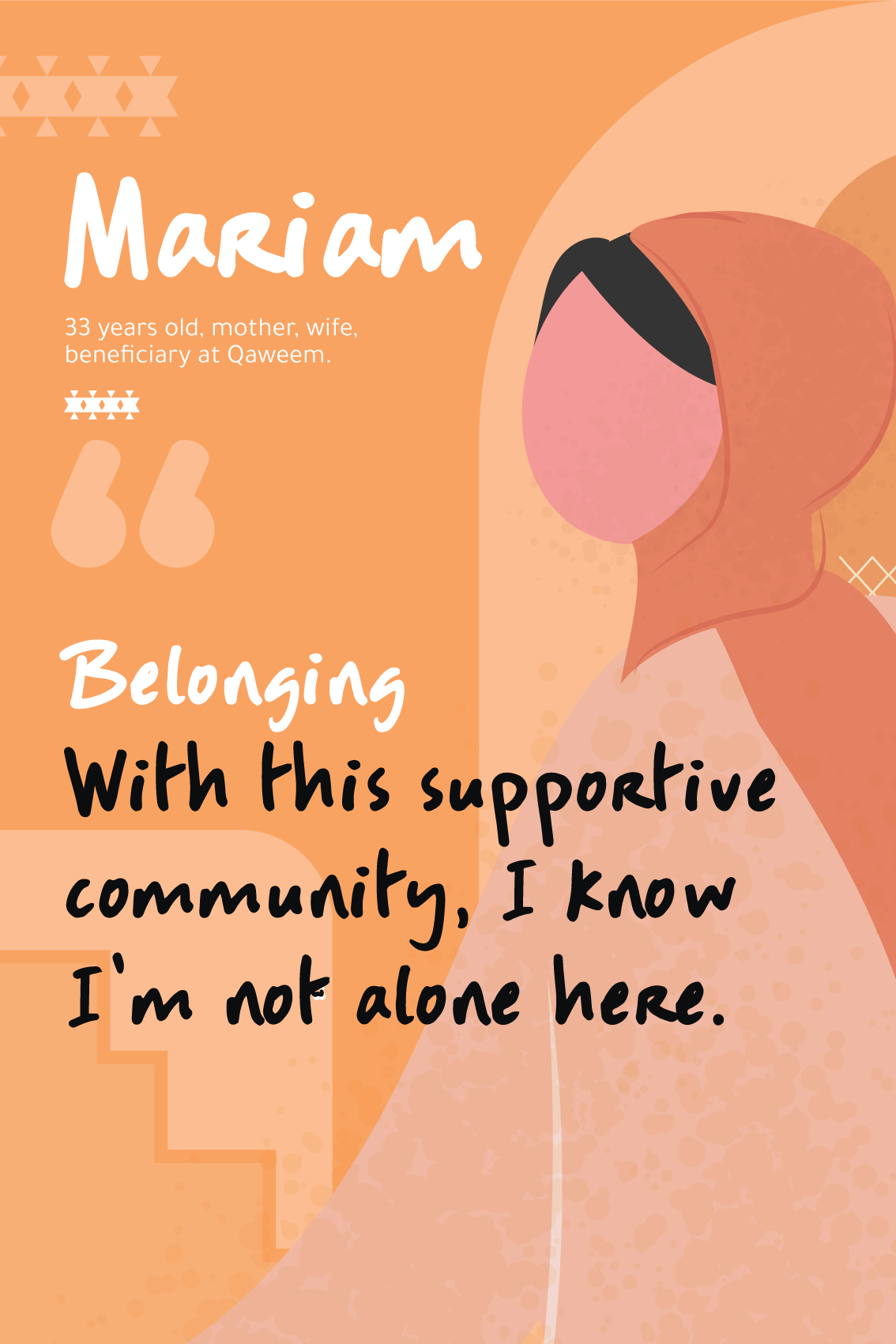
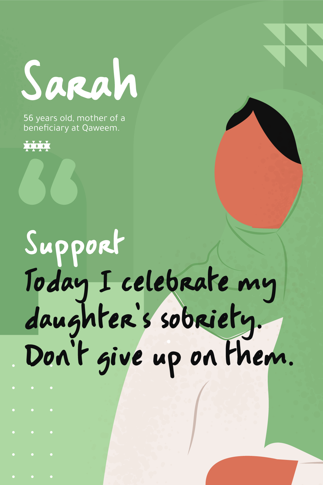
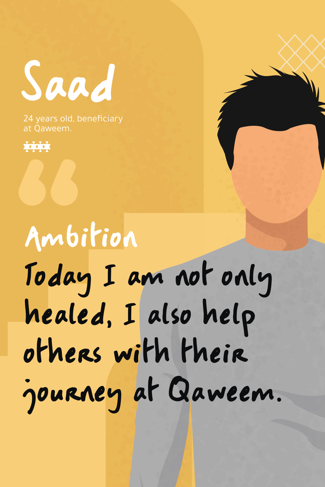
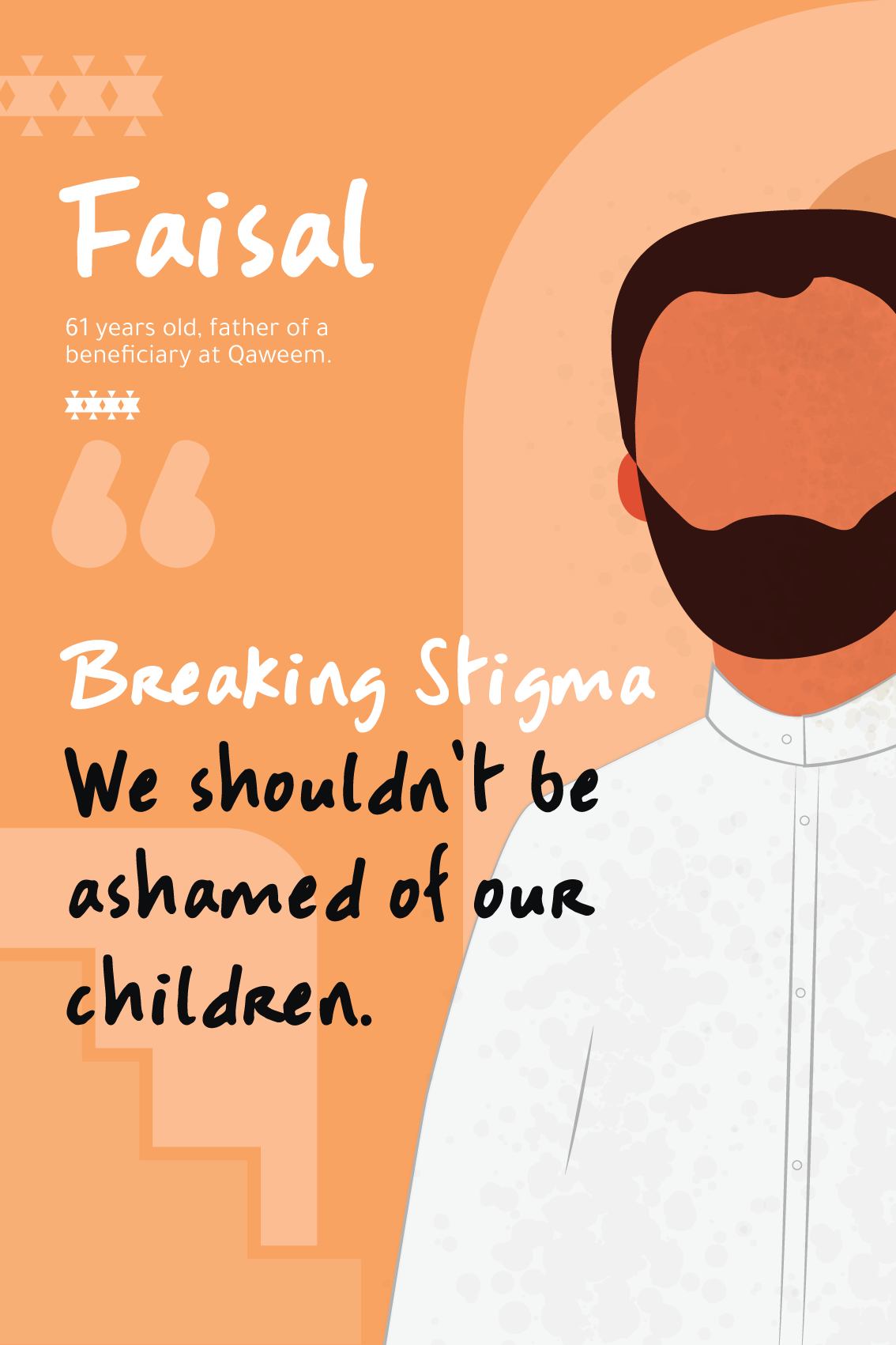
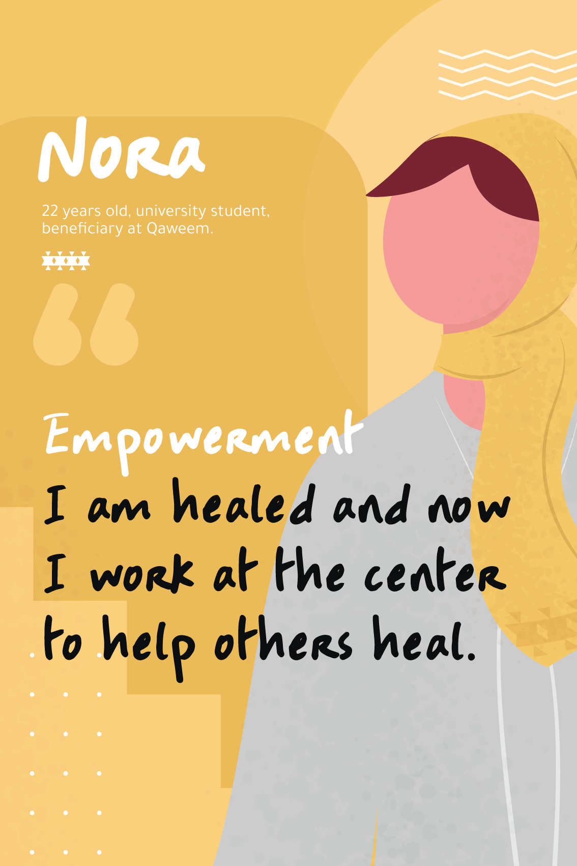
Creating success stories inspired by the recovered addicts we interviewed.
To increase admissions, we resorted to:
Rethinking the reception protocol for first time visitors (prospects) for it to be welcoming rather than intimidating.
Creating a sensory lobby experience.
Putting together a Wall of Fame in the lobby highlighting success stories of famous recovered addicts to encourage new prospects towards recovery.


We enhanced the beneficiary’s experience by:
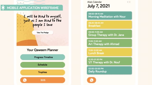
Digitizing their health records by creating an application and adding a notification option that helps beneficiaries and their parents track their progress.
Creating branded welcome kits and redesigning the space to convey a healthy and inviting environment for the beneficiaries, from the accommodation to the common spaces.
Creating moments of delight, to reinforce the notion of a judgement-free, healing zone.
Recommending a career guidance protocol after addicts graduate from Qaweem in order for them to feel supported at every part of their life.
Recommending to opt for the materials like asphalt drives, textured pavement, brick walks, and wooden decks, which are familiar to patients’ neighborhoods to make them feel safe and welcomed.
Brand Identity
The old Qaweem logo featured two men holding hands with very bright colors. For the rebrand, we went towards a more inclusive logo with the same original color palette, connoting the healing powers of nature, but more elevated and refined.
The new logo direction reflected the success and the healing journey of the beneficiaries at Qaweem. The shapes are inspired from local Saudi culture and motifs like the Katt and Najdi styles in addition to symbolic representations of success, hope and empowerment..
We also brought their brand to 2020 through more dynamic graphics that revolve around storytelling, in addition to the modern take on the logo typeface which we created from scratch as well.
The 3 stages of the Qaweem journey were represented through entering the center, climbing the stairs of recovery, and reaching nature, a stage that signifies healing.The graphics each revolve around a story of togetherness, breaking taboos, creating a healthy community, and building a strong foundation together.
To add the concept of privacy for the brand identity, all the graphics of the men and women have no facial elements connoting confidentiality, which is a major aspect of the local culture, especially with rehab hospitalization.

Results
Qaweem has currently launched their own website and ameliorated their social media presence. They are also gradually rolling out the new brand identity implementation at the center with regards to interior design and branding. As a result, only during Q2 2021, Qaweem received high levels of differentiation and increased its brand equity. Qaweem now takes 70 calls daily on average and 23% of them convert into admissions.


People Also Viewed


Blue Hat™ - All Rights Reserved.