Auto Glow
Creating An Identity Grounded in Luxury and Efficiency for A Car Care Service Provider
Project Type
Branding
Location
Saudi Arabia
Industry
Services

Challenge
Autoglow, a Saudi Arabian high-end car care service provider, offers moments of delight to its clients. As an agile caterer, it is able to satisfy the clients’ and their cars’ needs with utmost sophistication through the latest trends.
They approached Blue Hat in order to create a branding strategy that conveys the brand’s ethos and values. The aim was to ensure that they are not to be confused with a car wash as their touchpoints are quite different.
Autoglow wants to be perceived as the best high-end car care service in Riyadh that offers moments of delight throughout the experience and caters to B2C as well as B2B clients for reasonable prices. It is crucial for the brand to convey agility and the ability to cater to all car care needs from the simplest to the most sophisticated no matter where you are, offering the latest trends in car care services.


Intervention
Our team kick-started the project with the aligning brand’s image & vision. Autoglow is to provide the best high-end car care services while transforming the customers’ moods and how they feel about their cars.
The brand’s essence from dynamism, reliability to transformation, sprung the designs’ direction and approach. For that, the reflection of those values reflected directly, echoing the magician brand personality as well as the agility of the brand.

Results
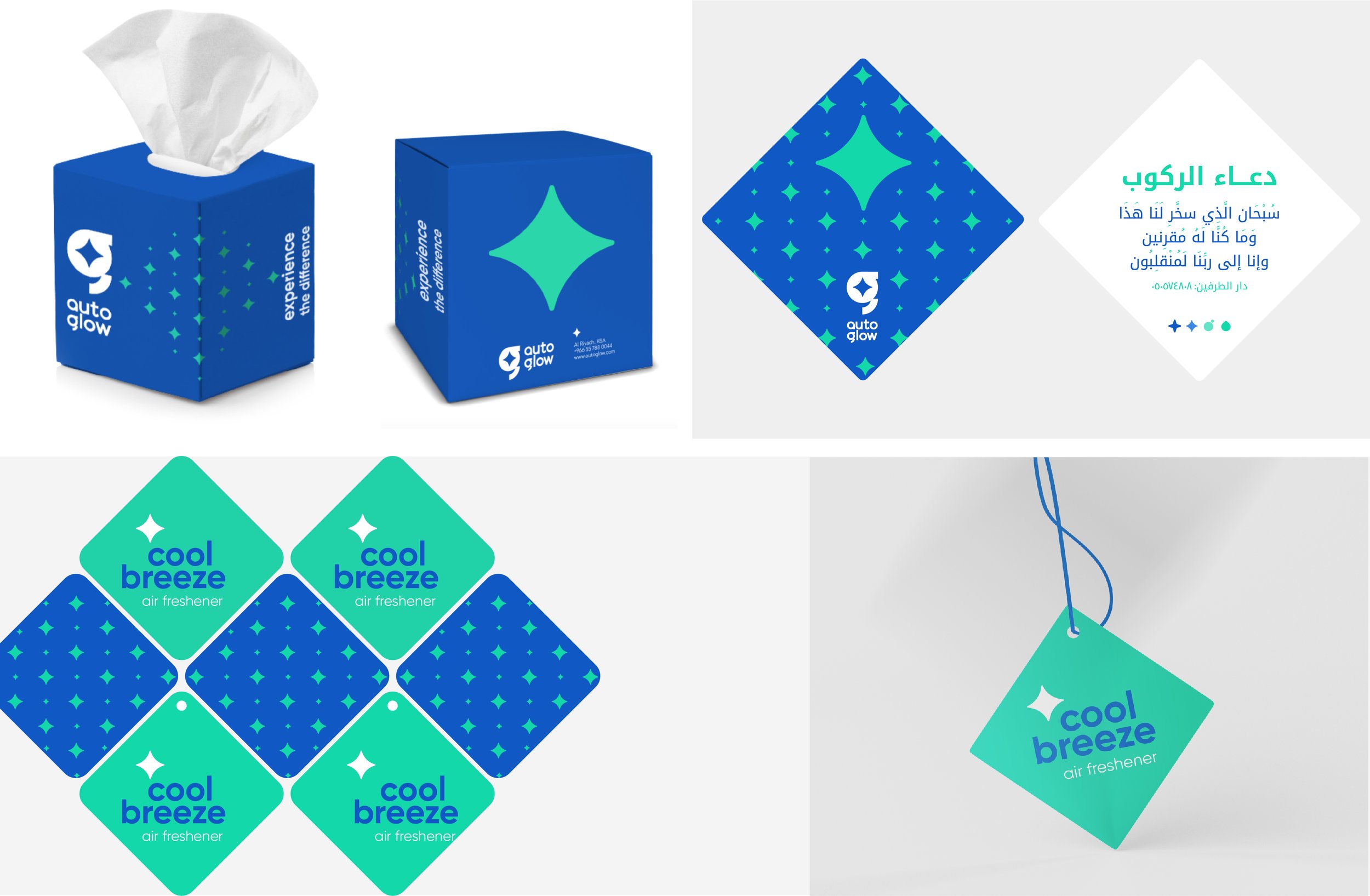
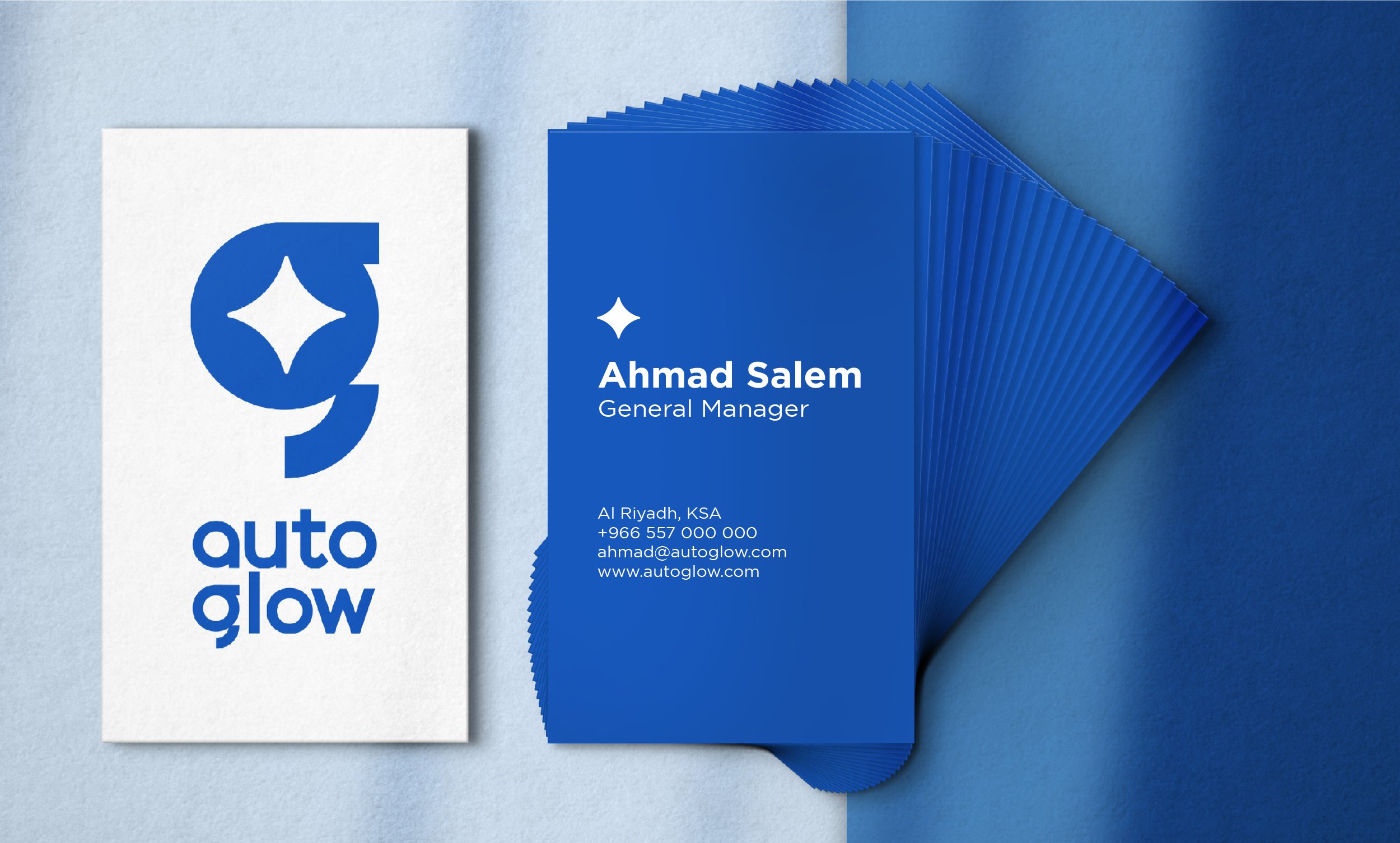
By providing high-end car care services catering to all customers’ needs, not to mention the moments of delight throughout the experience, Autoglow transforms customers’ moods and how they feel about their cars which is reflected in the name and brand identity. To reflect the brand’s core values, the logo reflects dynamism and sophistication as well as friendliness and bold expression with a chunky and modern fusion of the letters a and g (referring to autoglow). The use of lowercase and rounded shapes in the letters conveys approachability and youthfulness. The brand echoes the magician's brand personality through the element of surprise as well as the star shapes used inside the letter g to portray the concept of glowing and sparkling as well as dynamism through the morphing of the shapes. The colors used are contrasting and youthful balancing between an electric blue and bright/fresh shade of blue-green.


People Also Viewed


Blue Hat™ - All Rights Reserved.