PPC Brand Architecture
Turning A Single-Use Plastic Manufacturer Into An Innovative Hub for Packaging Solutions

Challenge
PPC is a B2B single-use plastic manufacturer located in Saudi Arabia whose target audience is large corporations such as retailers or F&B companies. They previously approached Blue Hat for Innovation Consulting, and now they had chosen to go with some of the new innovation routes suggested within the previous strategy. Following through with that, PPC decided to revamp their branding to fit this new vision.
Intervention
Our innovation team began by an assessment of the bottlenecks PPC had in their brand tangibility, from the internal culture to their offerings and communication channels. Besides the main issue of sustainability with single use plastics, we found after our audit that the company followed a very traditional approach, and still lacked innovation in many of its processes.
To continue with our discovery phase, we delved into sustainable packaging, smart packaging, consumer behavior; as in how people consume food and packaging, what are their wants and needs and what they’ve been demanding with the changing cultural scene around the Kingdom. The main insight we deduced from our research was that with many Saudi Arabian women moving into the workforce, a lot of families are now looking for pre-prepared and pre-packaged food. This translates as more reliance on takeaways from restaurants and online food delivery which increases the demand for new packaging designs to be released in the market.
Nevertheless, the client still wanted to cater to the B2B market with single use plastic for retailers and F&B companies offering packaging solutions for products like juice, yogurt, etc., as it was their single biggest revenue stream. However, they were also aware that in order to cater for the SMEs (providing takeaways and online delivery), they will need a different product line and different marketing strategy, ultimately, they needed a new brand.
So, we suggested creating a new brand architecture for PPC, while keeping it as the main brand, and having two sub-brands under it; Taghleef and Packlab. PPC would still target large corporations while Packlab would cater for SMEs, producing packaging solutions for granola bars, juices, yogurts on the go, and more, and Taghleef would go into the modern trade, such as supermarkets and restaurants, to sell their products through them to households.

For PPC, we revamped their vision: “To lead & disrupt the packaging industry in KSA through new capabilities and added- value products”. Their new purpose was to support brands in providing the best experiences for their customers through packaging solutions. PPC’s main offerings still included plastic manufacturing and production, new product development, and management of the new sub-companies / brands. Their target audience was defined as industrial clients (food & beverages, homecare, etc.), commercial clients (Packlab), and households (Taghleef).
For Packlab, the main vision was to be the go-to partner for brands in the F&B industry by offering A to Z innovative & sustainable packaging solutions. The purpose was to contribute to a better world by empowering F&B brands to make smart decisions for their businesses. Packlab’s main activities would entail F&B packaging solutions, consulting, new product development, R&D, and strategic partnerships with technology suppliers. Their target audience included commercial clients such as restaurants, cafes, bakeries, juice bars, catering, delis, etc. and wholesalers for some contracts.
On the other hand, Taghleef’s main vision was to provide every household in KSA with packaging products with enhanced designs and functionality, to cater to their daily needs. The purpose of this sub-brand was to delight families, build moments, and care for their unique needs and versatile lifestyles. The main activities Taghleef would partake in are plastic manufacturing, R&D, consumer behavior studies, and new product development. And finally their target audiences consist of end-users such as households (families, singles, etc.), channels to be distributed to modern trade and traditional markets as well as wholesalers, and products that are disposable food packaging/ catering.
Results
Followed by the brand naming workshops we conducted with the client and the creation of a brand for each sub-brand, which included the personality, offerings, brand style, values, we commenced with the brand identity and brand tangibility.
PPC
We created a brand identity for PPC that included the use of balanced forms, to echo its serious/solid Ruler personality. The colors used represented an ecosystem, and seep through to Packlab and Taghleef as well. It is inspired by elements of nature bringing together the hard and the soft in one image. PPC takes on a deep, serious shade of blue similar to petroleum’s color which echoes the brand’s personality as well as the industrial and scientific aspects of the brand.
For the brand tangibility, we started with the offerings and recommended integrating packaging solutions where products would have more added value, new product ranges for different clients, and design customization for a more integrated customer experience. Our recommendations for the space entailed specific interior design guidelines such as collaborative spaces, biophilic design, recycling stations, interior branding (offices) that reflected company values, wayfinding, and more. We also recommended that the factory and trucks would be branded too for a cohesive identity.


Packlab
As for Packlab, we created the logo with the common shapes and details with all three logos, however giving it a more sleek and dynamic letterform to connote the efficacy of a consulting company. The use of hints of each other’s colors was present and intended to create an ecosystem and familiarity between the brands. Packlab as a consulting brand takes the light green color that echoes sustainability and the innocent brand personality.
The brand tangibility options for Packlab included consulting where clients can be advised on packaging solutions to complement their brand image, customization of designs, decorative solutions, innovative designs, and sustainable products: biodegradable, plant-based, ocean plastic, etc. We advised that the space had to include an innovation department with a new layout, design studio, and a display corner to showcase different designs and brands. Active participation in fairs and exhibitions to attract new F&B clients was also very important.


Taghleef
It is clear that Taghleef belongs to the same brand family as PPC and Packlab, but is different in terms of offerings and personality. The letterforms of all the logos have similar geometric shapes, however for Taghleef the customised Arabic font is perceived as playful and friendly to reflect the caregiver personality. The brand identity is also reflected in the kind and vivid teal color of the logo.
The brand tangibility for Taghleef, started out with the offerings where we recommended they start selling PPC-branded products, and implementing a reward scheme for wholesalers. We also suggested in our solutions that there should be a display corner at PPC to showcase the different collections.


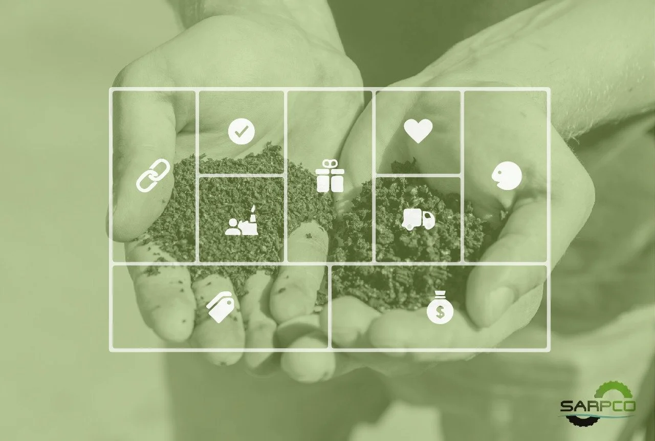
The common touchpoints for the main brand, PPC, and the two sub-brands, Packlab and Taghleef, were the communication and behavior, where we mapped out the digital channels, the corporate profile, introductory and project video content, catalogs that include both digital and print, certifications, branded material such as contracts, letters, etc., digital ads, and new label design. When it came to talent, our teams set up solutions like targeted talent acquisition, building capacity with training, team building events and activities, recognition and incentive schemes.
PPC’s brand architecture is now defined with a clear purpose and vision, along with its sub-brands that now serve different purposes in the market. The solutions our team came up with allow for sustainability and innovation in different brand touchpoints, and give the whole company a cohesive and clear brand direction.


People Also Viewed


Blue Hat™ - All Rights Reserved.