
Cubic — Building a Brand for Modern Storage
Creating a Bold, Seamless Brand Experience Across Every Touchpoint
Project Type
Brand Strategy / Brand Identity / Digital Experience / Spatial Branding / Environmental Graphics / Wayfinding / Brand Experience
Location
Saudi Arabia
Industry
Self-Storage
Challenge
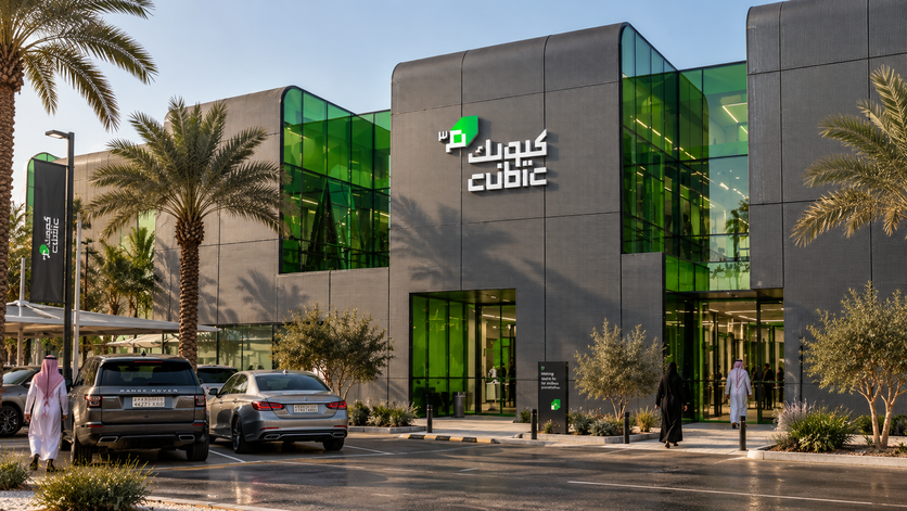
Saudi Arabia is experiencing rapid urbanisation and a shift in how people live. As residential development increasingly moves toward apartments and more compact living environments, the need to make better use of available space is becoming increasingly relevant. Industry research identifies urbanisation and smaller living spaces as key drivers of demand for self-storage in the Kingdom.
At the same time, Saudi Arabia has a remarkably young population, with more than 60% of the Kingdom's population under 35. Younger consumers are increasingly shaping expectations around convenience, connectivity and how services fit into everyday life.
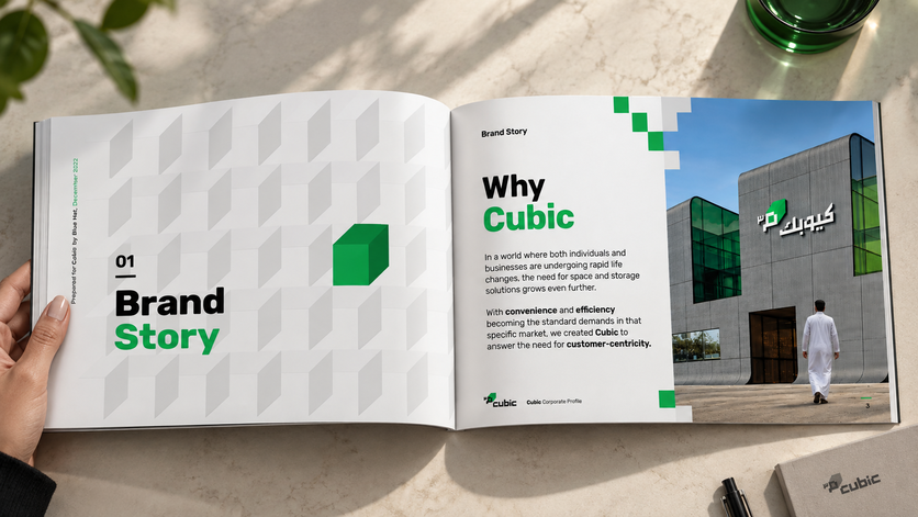
For Cubic, this created an opportunity to rethink what a self-storage brand could look and feel like.
The challenge was not simply to create a visual identity for a storage facility, but to build a special, seamless and frictionless experience around it — one that could connect physical spaces with digital touchpoints and speak to a younger, digitally native audience.
Cubic needed to feel bold, striking and dynamic, moving away from the conventional visual language of storage and creating a brand that felt relevant to the people and businesses shaping modern Saudi Arabia.
Intervention
We began by defining Cubic's strategic foundation — establishing its brand positioning, story, personality, values, verbal identity and visual language.
At the heart of the brand is the cube: a simple geometric form that connects the name Cubic with storage, volume, space and organisation. We developed this into a distinctive visual system built around “Augmented Cubism,” transforming the cube into a flexible graphic language that could adapt across environments and media.
Cubic was defined through the Hero personality, positioning the brand as an enabler that removes friction and gives people the space they need to move forward.
From there, we built the brand as an ecosystem rather than a collection of individual applications.
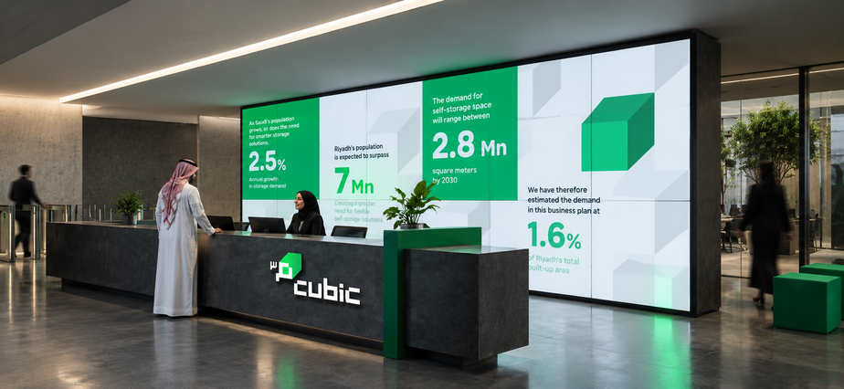
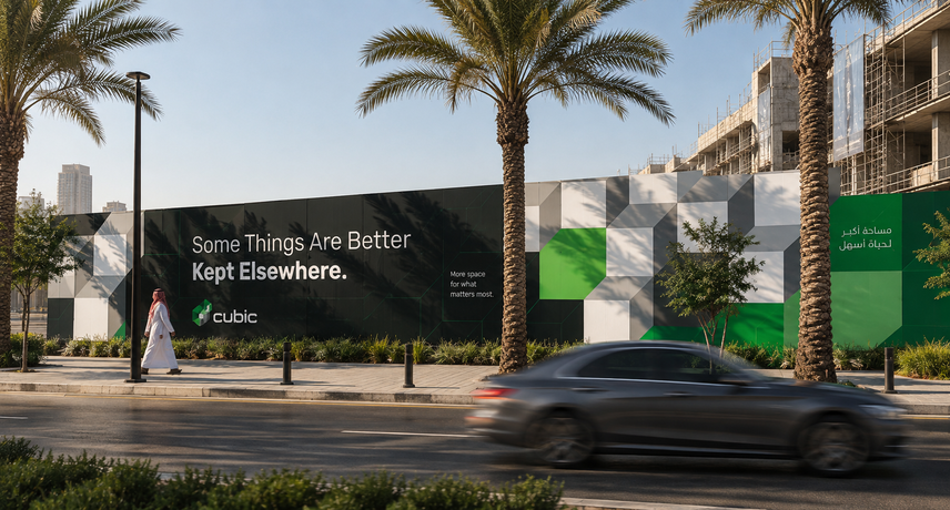
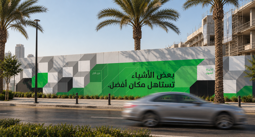
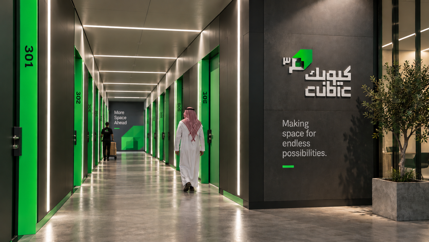
The identity was translated into the physical customer journey, from construction hoardings and exterior branding to the facility's interior experience, environmental graphics, signage and wayfinding. Geometric forms, bold typography, green accents and dynamic information systems were integrated into the architecture to make navigation feel intuitive while reinforcing the Cubic brand at every stage.
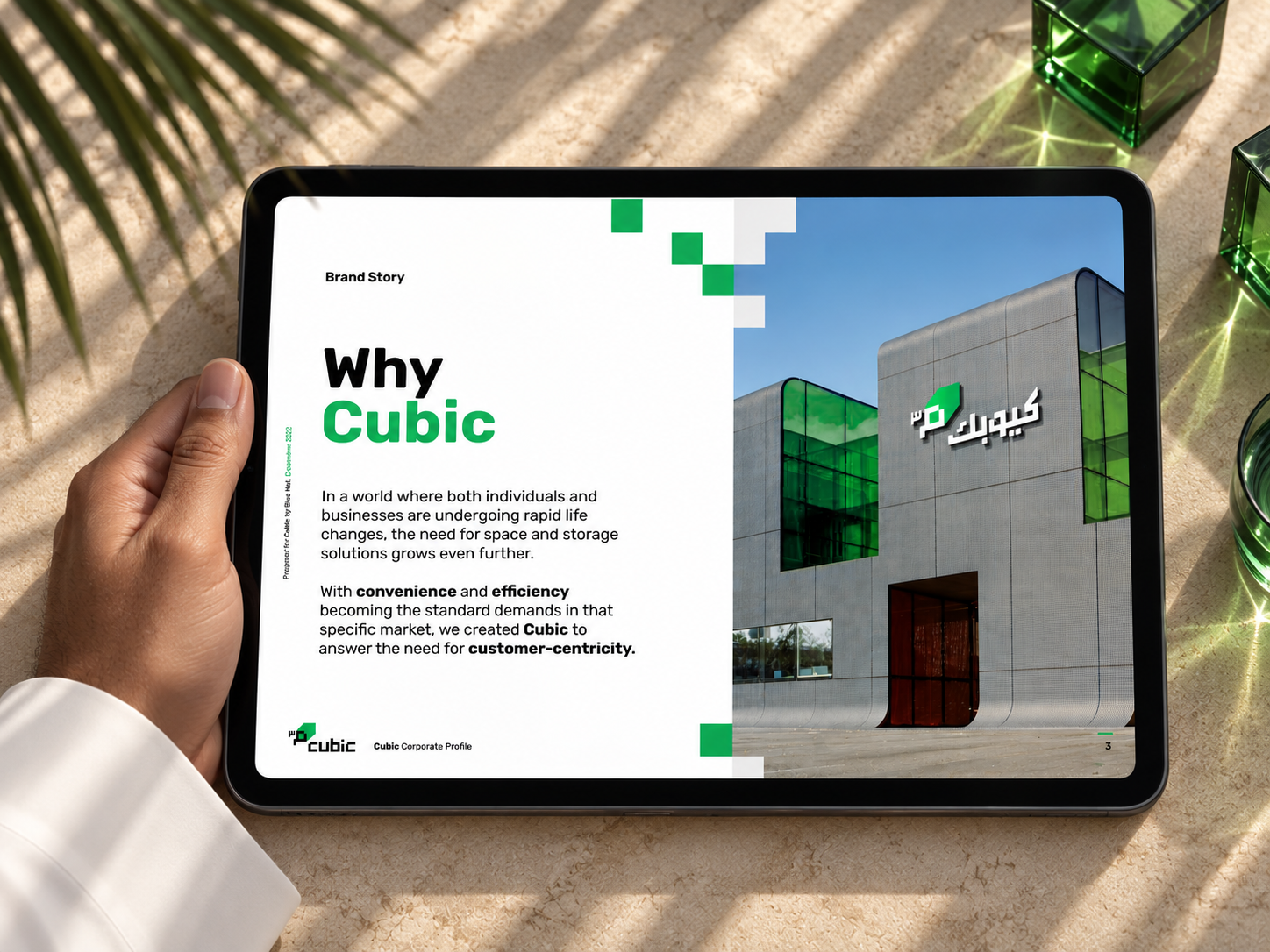
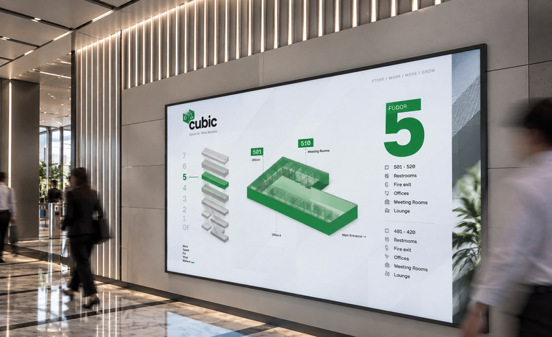
Particular attention was given to wayfinding, creating a visual system that could help customers move effortlessly through the facility. Digital screens, floor maps, directional signage, unit identification and environmental graphics were designed as one connected language — reducing friction while making the experience feel considered and distinctly Cubic.
The same thinking extended into Cubic's digital ecosystem, including its website and app. Rather than treating digital as a separate brand application, we created continuity between the physical and digital journeys, ensuring that the same visual cues, language and logic carry through wherever the customer interacts with Cubic.
We also developed the corporate profile, communication materials and brand guidelines, establishing the rules and tools needed to maintain consistency as the brand continues to grow.
Because the brand primarily speaks to a younger, digitally native audience, the identity was deliberately designed to be confident, energetic and contemporary. Its bold typography, striking green palette, geometric graphics and dynamic compositions give Cubic a character that feels closer to the world of technology, lifestyle and contemporary retail than traditional storage.
Results
The result is a fully integrated Cubic brand experience, connecting strategy, identity, architecture and technology into one seamless customer journey.
From the first construction hoarding to the website and app, from the reception experience to digital screens and wayfinding, every touchpoint was designed to work as part of the same system.
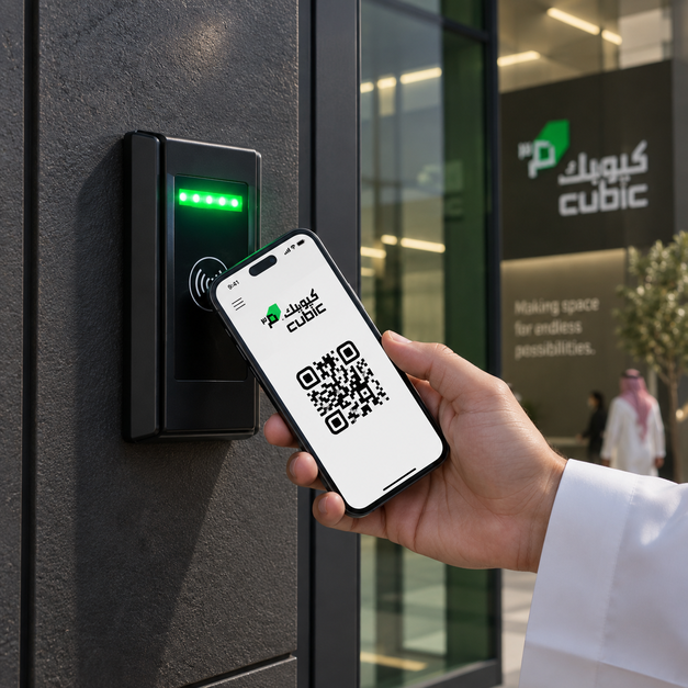
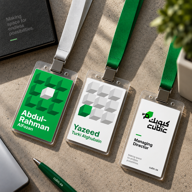
The brand transformed self-storage from a purely functional service into a more accessible, contemporary and experience-led proposition — one designed around how people live, move and interact today.
Most importantly, the work created continuity between the physical and digital worlds. Customers encounter the same brand language whether they are discovering Cubic online, navigating the facility, finding their unit or interacting with its digital services.
Through this approach, branding became more than a visual layer. It became a tool for creating a frictionless experience, helping people understand, navigate and engage with Cubic with greater ease.
People Also Viewed





Blue Hat™ - All Rights Reserved.