Sucre de Nada
A Mother’s Touch: Finding Back the Voice and Uplifting Brand Image of a Family-Run Patisserie
Project Type
Branding
Digital Marketing
Achievements
Muse Creative Awards Gold Prize for “Social Media - Food & Beverage”

Challenge
Sucre de Nada is a family-run and operated patisserie based in Jeddah, KSA. The concept was created by Nada, a mother and baker, who creates her desserts and cakes with care and fresh ingredients. Nada is known to be a trendsetter in introducing new classic desserts to the market, and her pastry shop has acquired quite a good reputation in Jeddah.
With new, up and coming desserts parlors opening every now and then in KSA, Sucre de Nada had to re-anchor its leadership positioning in the F&B industry. The team approached us to rebrand the store in Jeddah and expand out to Riyadh.
Intervention
We started out the discovery phase with an internal reflection that included getting to know the brand story and how the client envisions Sucre de Nada. After that, we conducted a brand audit where we performed a scan of the brand’s digital presence, social listening to analyze prevalent sentiments and insight gathering from regular customers (7) and mystery shoppers (2 - delivery and dine in). We also conducted a trends and case studies analysis to harness trends and showcase lessons learned.
After the brand audit was completed, we discovered that the main obstacle Sucre de Nada was facing was lack of storytelling. The brand had a heartfelt story that would definitely engage customers, but it wasn’t portraying that story in any tangible aspect.
Our team worked on a methodology that consisted of unveiling and retelling the story of Sucre de Nada both in a visual and written language. The strategy included defining the brand’s voice and image, enhancing brand tangibility (offerings, communication, behavior), and uplifting the brand image and physical space.

Results
We transformed a family-owned business into a brand story that manifests itself at every touchpoint in-store and online. The narrative of this brand was a crucial part of this project because we wanted to showcase Nada’s ethos as much as possible - we knew it was the selling point of the business. We positioned the brand as the only homemade-style pastry shop that offers fresh, staple desserts in a warm atmosphere to sweet tooths in KSA looking to indulge or connect with loved ones.
We created the brand tangibility to include customer-centric offerings to engage with customers beyond sales, be there for their special occasions, create moments of delight and reward the loyal customers they had acquired over the years. These included seasonal items and packaging, branded greeting cards, retail corner, secret loyalty rewarding system. For communication, we uplifted their brand image and voice on social media and included marketing tactics that mirrored the new brand vision, such as notes from the founder inside the packaging, themes for the branded greeting cards, and more.
Environment conceptualization followed suit with layout design, flexible displays, color palettes for the space and the visual identity, that will hopefully be implemented in their new brand opening in Q3 of 2021 in Riyadh. And finally, we created behavior guidelines such as contingency plan training and talent acquisition to increase retention and connection between the brand and its employees.
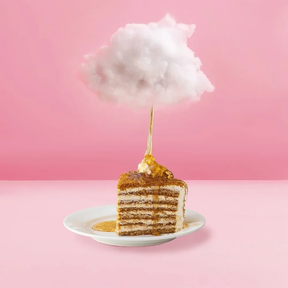
For the visual branding, we decided to move forward with a retro provincial direction that preserves the legacy of Sucre de Nada without compromising on modernity. We focused on refining and re-illustrating the original Sucre de Nada logo, thus giving it a conservative uplift. The shapes became more studied, the colors brighter, the strokes refined, and we added details like the letter S at the top of the vitrine instead of the whole brand name. Also, the font for Patisserie Sucre de Nada is elevated and brought to 2020. For the color palette, together with the client we chose pastel colors that echoed back to the visual identity. We also branded the packaging and the greeting cards with the same illustrations of the cake and flower motifs.
We encourage you to check out our latest work for Sucre de Nada and follow them on Instagram.


People Also Viewed


Blue Hat™ - All Rights Reserved.