La Pazzia
Chasing The Madness While Creating A Transportive Journey Within Everyday Rituals Through Coffee
Project Type
Branding

Challenge
La Pazzia, located in Al Khobar, Saudi Arabia, is a coffee shop offering premium Italian coffee in a dynamic yet relaxing atmosphere. Looking to create rituals that their customers can look forward to, they approached Blue Hat for a rebranding strategy that included changing their brand identity as well.

Intervention
Our team went on a mystery shopping experience for an insightful brand audit. They spent some time at the cafe, testing their offerings and examining what their experience was all about, including the overall design, functionality, customer servicing, environmental touchpoints like sound, smell, lighting etc.
In parallel, we worked on gathering the latest trends and case studies that were relevant to La Pazzia, in order to harness any lessons learned that included examples from unique and memorable concepts that savor experiential cafe. Also, as part of our research, we did a competitor scan to define a unique market positioning as per the socio-economic insights in Saudi Arabia to identify the customer’s wants and needs during their memorable experience.
To wrap up our research, we identified a gap in the F&B market, and this is where the concept of La Pazzia sparked. Inspired from the Italian bar-like experience, we created a transportive journey that chases madness within everyday rituals.
With its defined target audience, we refined the brand’s aims and wants, along with its purpose, values, and onlyness statement as such:
“The only coffee retailer that offers premium, fresh Italian coffee in a dynamic yet relaxing space to young millenials and businesses in KSA, looking to create rituals that they can look forward to in their routine in an age where the café market is saturated and full of replicas.”
La Pazzia was then defined as the explorer, focusing on the values of boldness, sophistication, excellence, connection & dynamism.


Results
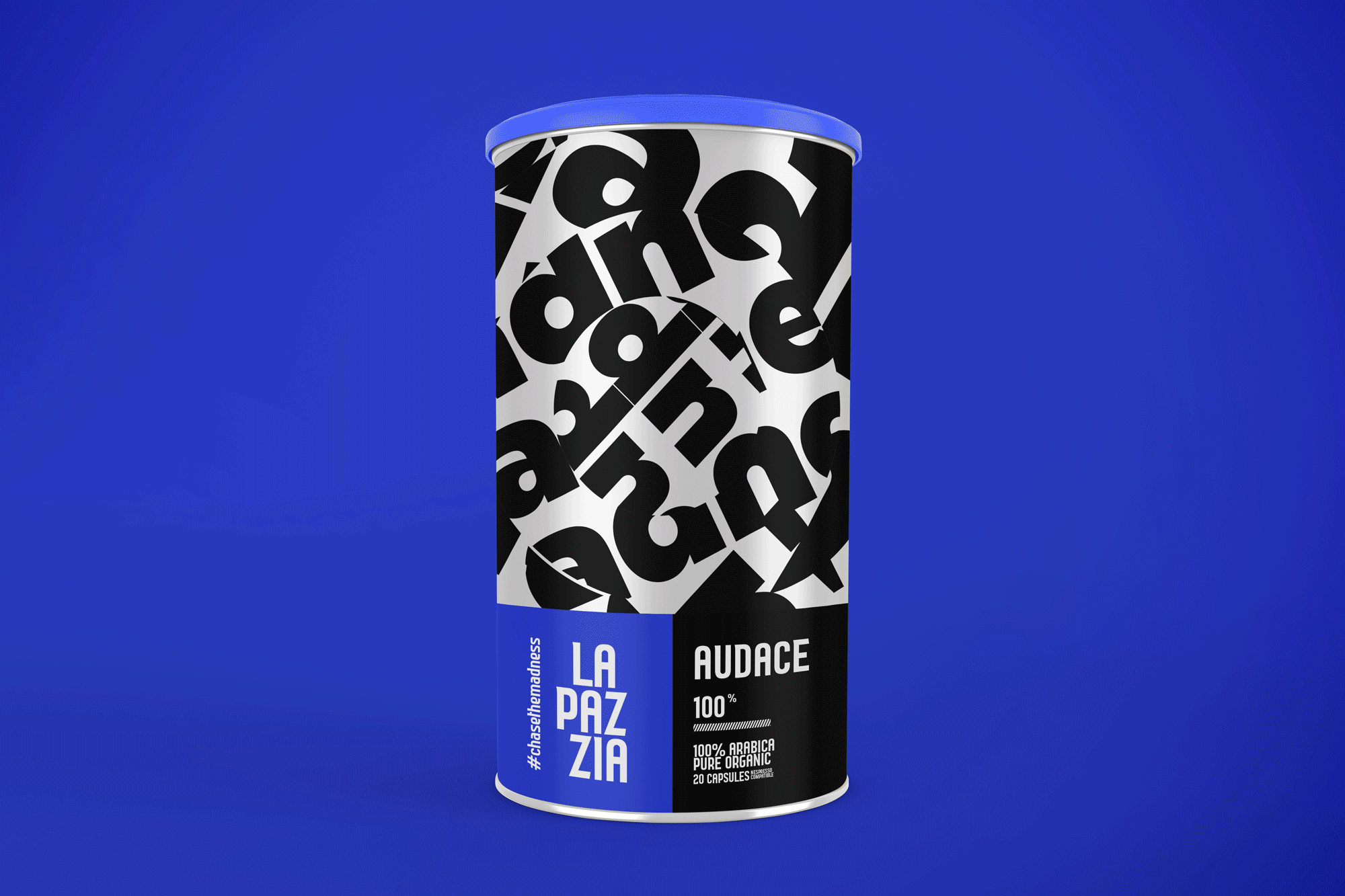
To preserve the brand’s recognizability, the recommended logo works as a simple uplift of the initial La Pazzia logotype by using a more contemporary typeface with nail-shaped corners and details which adds a hint of madness to the image while creating a more balanced composition through proper grid and alignments. The color palette balances between Azzurri blue which is a nod to the Italian heritage and aesthetic in addition to a family of warm colors which act as indicators of madness going from bright yellow (level 1 of madness) all the way to crazy red, followed by the Azuri blue which scientifically is the strongest flame color hinting at the highest level of madness or strongest coffee flavor.
Sophistication is preserved with the introduction of black and white which helps tone everything down and give the entire brand more elegance and a high-end feel. Knowing that La Pazzia means ‘ The Madness’ in Italian, we experimented with various typographic treatments characterized by boldness, dynamism and loud eccentricity to echo the mad aspect of the brand. These treatments are used across the identity especially on the packaging to distinguish each coffee flavor in addition to using the different color tones to differentiate between various levels of coffee intensity. Also, each flavor of coffee has its own unique Italian name that is synonymous to various concepts of madness, adventure and creativity.


People Also Viewed


Blue Hat™ - All Rights Reserved.